

Guided Selling on Shopify: Why a Quiz Beats a Filter Menu
A coffee roaster had 60 products and a nine-option filter sidebar almost nobody touched. Filters assume the shopper already knows the answer. Here’s what we built instead, how the weighted scoring works, and the case where the quiz refuses to give a confident answer.
Quiz Buddy
4 min

A coffee roaster came to us with 60 products and a filter sidebar offering nine ways to narrow them down. Roast level, origin, grind, caffeine, bag size, the usual set. Almost nobody clicked it.
That surprised them. It didn't surprise us.
A filter menu assumes the shopper already knows the answer. "Pick your roast level" only works if you know whether you want a medium or a dark. Most people buying coffee as a gift, or trying a new bean for the first time, have no idea. The filter sidebar was a database query wearing a shopping experience costume.
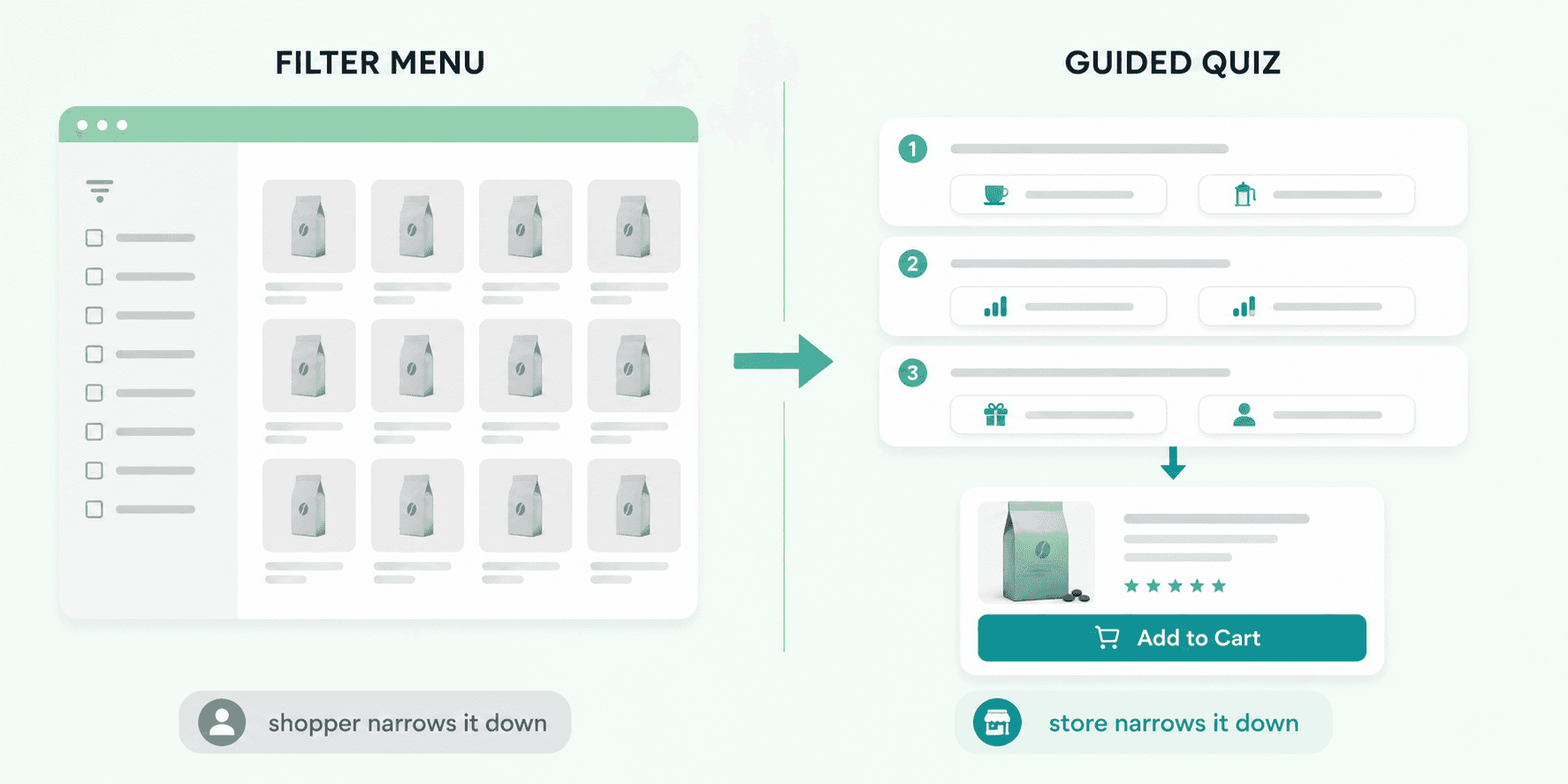
What the shopper is actually being asked to do
A collection page hands over the whole catalog and wishes you luck. The work of narrowing 60 products down to one gets pushed onto the person with the least information about the catalog.
In a physical shop that never happens. Someone asks what you normally drink and whether you own a machine or a French press, then hands you a bag. Two questions, done in a minute.
Guided selling is that conversation, rebuilt for a storefront. You ask a few short questions and hand back an answer instead of a grid.
What we built: three questions and a score
For the roaster, Quiz Buddy asked three things. How do you brew it. How strong do you like it. Is this for you or a gift.
Three questions, then one product with an Add to Cart button sitting right underneath it.
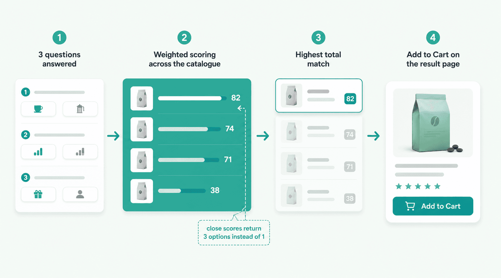
Weighted scoring, not a lookup table
The lazy way to build a quiz is a lookup table. Answer A plus answer B equals product 7. It works on day one and breaks the first time the catalog changes, because somebody now has to rewrite the rules for every answer combination.
Weighted scoring works the other way around. Each answer adds points to the products that match on that attribute, and the highest total wins. Add a new bean, tag its attributes once, and it starts competing in the scoring on its own. The merchant never opens the logic again.
That difference is invisible on the storefront and it's the whole reason the quiz still works six months later.
Where it sits matters more than how it looks
The app supports a floating widget, an inline banner, a sticky bar, a product page block, and a custom theme app block placement.
We put the roaster's quiz as an inline banner at the top of the collection page, exactly where the filter menu used to be. That's the moment of hesitation. A floating bubble in the bottom corner gets ignored by the same people who were already scrolling past products they didn't understand.
Placement is a merchandising decision, not a design one. Put it where the shopper stalls.
The parts that aren't obvious from the outside
What happens when nothing scores well
This is the question most quiz builders skip.
Sometimes a shopper's answers produce a top match that only barely edges out the next two. Showing one product with total confidence at that point is a lie.
So there's a threshold. When the winning score doesn't clear the runners-up by enough, the quiz returns three options with one line each explaining what separates them, instead of pretending to be certain. A confident wrong recommendation costs more than a slightly hedged right one. The product comes back as a return and the trust doesn't come back at all.
The results page is the actual product
Everything before it is a form. Nobody enjoys filling in a form.
So Add to Cart lives on the result itself, not one click away on the product page. A shopper who answered three questions has already told you what they want. Making them navigate somewhere else to buy it is a strange thing to do at that exact moment.
Quiz answers are data your analytics won't show you
After a few hundred completions, the roaster noticed that most people answering "gift" were also answering "no machine at home."
They had nothing built for that person. No gift-ready set, no pour-over starter pairing. They fixed it with a Build Your Box bundle and pointed the quiz result straight at it.
That signal never appears in a standard analytics dashboard. Sessions and bounce rates tell you people left. Quiz answers tell you what they were looking for on the way out.
When a quiz is the wrong tool
I'll say the unpopular part. Plenty of stores shouldn't add one.
If you sell eight products, a quiz is overhead in front of a page the shopper could have read in thirty seconds. If most of your traffic arrives already knowing the exact SKU, a quiz is a speed bump.
Quizzes earn their place when the catalog is big enough to be confusing and the difference between products depends on the shopper rather than the spec sheet. Skincare, coffee, supplements, gifting, anything where the right answer changes person to person.
If your products differ mainly by size and colour, fix your filters instead. Cheaper and faster.
Have a catalog people get lost in?
If shoppers are landing on your collection page and leaving without clicking anything, the problem usually isn't the products. It's that nobody is asking them a question.
Tell us what your catalog looks like and what shoppers keep getting wrong, and we'll tell you whether a quiz would help or whether something simpler would.
Running a Shopify store that needs guided selling built properly? Get in touch.

Ashok Damaniya is the Chief Technical Officer (CTO) at Essenify, where he leads the development of Shopify apps focused on helping merchants increase sales and improve the customer experience. His expertise spans Shopify app architecture, e-commerce solutions, and scalable cloud infrastructure. He is passionate about building practical tools that solve real merchant problems and enjoys turning insights from the Shopify ecosystem into products that are simple, reliable, and impactful.
Reader guide
Use the links below to jump into next reading without leaving the article flow.
Blog categories
Recent posts
First Order Discounts: How to Increase Shopify Conversions
10 minutes
How to Feed Dynamic, Merchant-Configured Data Into a Shopify Function (Input Query Variables Explained)
10 minuts
How to Bulk Update Shopify Prices Without Losing Your Original Ones
5 minutes
What Shopify’s Native Discounts Can’t Do, and Why We Built Discountify
4 minutes

